Information Architecture Made Easy With 3 Example Sitemaps
Information Architecture might sound big and confusing, but it’s really just organising information in a logical way so that people can find their way around and get what they need.
Striding through the supermarket the other day, I could glance at the signs for each aisle, read the 4-5 categories for each, and easily skip the aisles with things I didn’t need, and quickly find the things I did.
When planning a website’s information architecture I like to start by making a quick sitemap and then think about how it meets the users needs, the business goals, and how search-engine friendly it is.
-
Users
Some research may need to go into understanding what users do on your website before “converting” to a lead/sale. For most businesses there will be smaller steps on the way to converting that need to be right to build trust and sell the value that your website provides.
Information Architecture is NOT just about displaying your information in an order that you think is logical. Be sure to flip your thinking around. It’s about helping your website visitors easily get what they want. Talk to your target market, find out what they want, look at trends and data, find out how they will use your website.
-
Business Goals
While you are planning out your website’s information architecture, stop a couple of times and check that it still lines up with your main business goal (i.e. lead generation for a builder’s website).
-
Search Engine Friendly
When undertaking a new website project you may want to consider where any extra-for-SEO pages might fit into your information architecture, but beware of biting off more than you can chew, as a sitemap can easily add to the project scope. Start small, perhaps with 2 keyword-focused landing pages rather than 10, depending on your resources.
A Few Case Studies
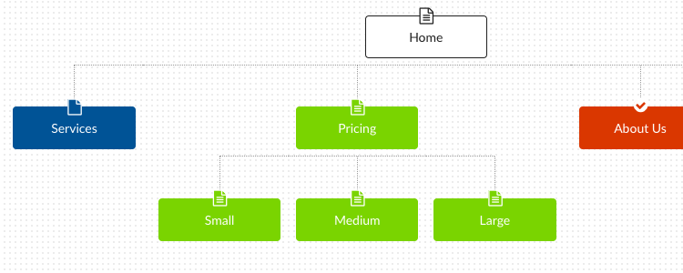
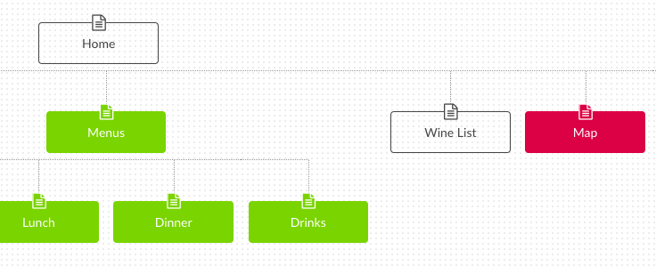
Here’s a few example sitemaps which comparing the information architecture of websites that sell services, experiences, and products.
1. Websites that sell services
Typically businesses that sell their time will have similar information architecture for their websites. In this category I’m lumping together tradesmen along with professional services like accountants/lawyers/ consultants, etc. A service sold as $ per hour, or fixed price based on the approximate value of $ per hour.
Business Goal: Generate leads – phone or contact form enquiries
User actions: Check credibility, review pricing and previous work, make contact
Search engine goals: To rank for niche keywords, often location-based.

View Complete Sitemap
2. Websites that sell experiences
Think restaurants, bars, mini golf, ten pin bowling, etc. A business that sells an experience, typically with a local focus.
Business Goal: Generate bookings/reservations or in-the-door traffic
User Actions: Find experiences (menu, activities) and pricing. Make a booking/reservation, or simply find opening hours and directions
Search engine goals: To rank for niche keywords, often location-based.

View Complete Sitemap
3. Websites that sell products
Here we’re looking at e-commerce websites. These are typically product categories, each with sub-categories, and possibly dynamic filtering to finish. On a Shoe store, this might look like first level categories being Women, Men, Children.
If you went into the Women category you would then find Heels, Flats, Sandals, etc. Dynamic filtering could further enable you to sort by factors such as Price and Brand.
Business Goal: Make product sales, repeat customers
User Actions: Find what they want, gather information, checkout
Search engine goals: To rank for all keywords in product range, with a focus on highly searched products
The information architecture and categories on your e-commerce site just needs to make sense to your shoppers so that they can easily find what they are looking for.

View Complete Sitemap
When planning your website, be sure to consider the information architecture before diving into page-level content. Feel free to check out one of our ‘Complete Sitemap’ examples to get an idea of how to lay out a simple sitemap.

Comments
5 Comments
Hi, we are looking at improving our sitemap. the current…. well say it is outdated.
We have been in business for 17 years and over over 82,000 sweepstakes and contest in our database. Our current site map is limit is 500 URL’s as I understand it. (I am marketing person and not tech) How many of those sweeps URL can your program handle? (your $14,99 and $29.99 plans)
Is your plans have auto daily updates of our sitemap or manual? We have a ton of daily URL changes, sweeps coming on as new and ones expiring.
We own many domains we want to open up over time that will be interconnected. example expiredsweepstakes dot com What we want to move a expired sweep from active sweeps and to keep them Google readable in Search. Can this be set up to move those sweeps automatically?
Last… Google hates so called “Index websites”. Trust me, I am top of their list. What are your thoughts on this issue and can your program help? I know going to a large number of new and old sweeps will help, but what else will your site map help in fixing our ranking?
Thanks and go win something.
Hi,
Is there a way to create co-existing hierarchies structures? I love your product but struggling to find a way to use it for my project. I’ve got lots of overlapping information, so I need to show that the child pages can be accessed from different parent pages.
Thanks
Heya, Thanks for reaching out! WriteMaps currently doesn’t allow for multiple items at the top level of the tree which we designate as the root e.g. yourwebsite.com … child pages under the domain could be the subdomains or subpages. That is how it is currently set up, but I think I can see a few use cases where how you are wanting to use it would be handy. I’ll have a chat to the team about this as a feature request. Cheers!
Agree with Elena. My use case is exactly the same, and this feature would be fantastic.
I think given how knowledge is accessed these days (think “wiki”), it’s almost a given that a structure like this will be used.
Beautiful write-up Alex, it was a fun and informative read – appreciate the effort! The navigation really can make or break the user experience on an eCommerce site as well. The inability to easily switch to another page will influence the session time and engagement rates. I was wondering if it is a good idea for eCommerce sites to implement a landing page for top-level categories in their site hierarchy, something that gives visitors a section overview.
Leave a Comment