Perfect Information Architecture for Your E-commerce Store: Allbirds.com Case Study
So you’re planning an e-commerce website, and you want it to be perfect. Simple and organised information architecture, with all your products organised into neat little categories. Just like the good folk at Allbirds.com who sell those woolly shoes that are all the rage in Silicon Valley.
You want visitors to skip through your site and find exactly what they need. They fill up their carts and check out, paying you their spending money for your awesome products. Ideal.
BUT… right now, you don’t have a website. Yet.
So what happens next? How can you turn your notes and ideas into a fully functioning e-commerce website?
You’re in the right place. Scroll along as we cover the basics of getting an e-commerce website created from woah to go, with an emphasis on planning and information architecture. Along the way, we’ll also be reviewing Allbirds.com as a case study in e-commerce information architecture.
Overview:
- Your Outcomes
- What is Information Architecture?
- Information Architecture Example: Allbirds.com
- Where do Landing Pages fit?
Your Outcomes
Let’s start with the goals. They’re likely to be something like this:
- Your customers need to be able to find your products, so that they can buy them (yay, money!).
- They need to be able to answer their generic questions about shipping, sizing, returns, and so on, within 30 seconds (the age of the internet has vastly reduced our collective attention span).
- Your checkout flow needs to be dead simple. Get the right product in the cart, and get the heck out of there.
- Oh, and you’ll be wanting SEO-friendly pages that will help attract organic traffic for your main keywords.
How can you achieve all this with minimum effort? Our recommendation… Be like Allbirds.com. We’ll jump into our case study below after explaining…
What is Information Architecture?
It sounds cumbersome, but it’s actually quite simple.
Information architecture is organising the content of your website in a logical, category-based flow of information. It’s about creating a website that is friendly for users and optimized for SEO.
Like many aspects of website creation and development, the whole point of information architecture harks back to user experience.
User-First Information Architecture
Make it easy for people to find what they want! That’s it.
Okay there’s more if we dig deeper…
- Who is your target market?
- What do they actually want? What is the value to them?
- Which words do they use to describe it and how do they talk about/ categorise it?
- What action do they take that might lead them to arrive at your website?
Talk to people. It’s actually way more important than just planning by yourself. With these answers you’ll have a clear direction for not just your marketing copy, but also how to organise the information architecture for your website.
Once at your site, there are 3 main paths that people follow:
- They can scroll (put your most popular products/categories on the home page)
- They can Search (make sure the basic search terms give good results)
- They can navigate via a Menu or Categories (use your customers’ language, and user test!)
You’ll be wanting to map out an easy to follow route tor each of these main paths.
Let’s look at how the pros do it.
Information Architecture Example: Allbirds.com
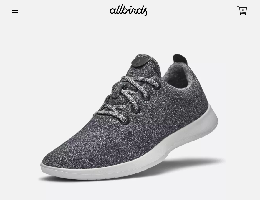
Allbirds are the Wool Runners taking over the world. We love them because they’re made with New Zealand superfine merino wool, and co-founded by a New Zealander. Good country that =)
Other than comfort and style (and did I mention ease of washing? That reminds me, I need to throw mine through the washing machine again…), there’s another more topical reason we love Allbirds. They keep their information architecture simple.
Their site can be divided into ‘Information Pages’ and a list of ‘Products’ sorted into ‘Categories’ (or ‘Collections’ in Shopify).
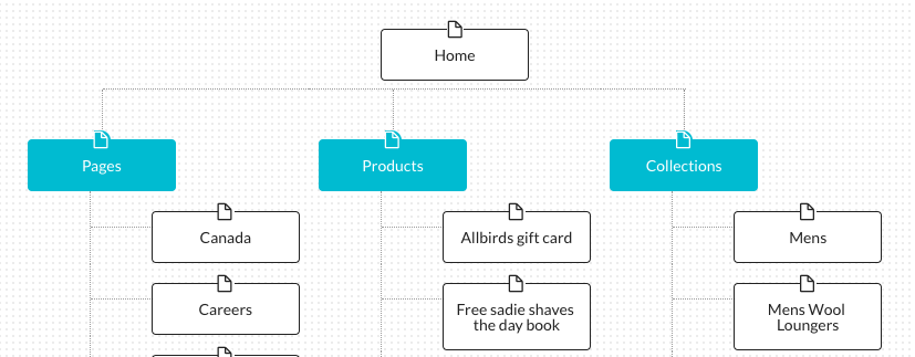
Take a quick peek at Allbirds’ Information Architecture.
Platform Tip: If you haven’t chosen a platform for your store yet, I’d highly recommend using either Shopify or Squarespace. Sure there is a monthly cost, but you’ll save time and money on design/coding bills by buying a pixel-perfect theme, you’ll have a perfectly optimised checkout, no headaches with integrating payment providers, and they provide a good base for SEO work (sitemaps, category/landing pages, etc.). Just do it.
Product/Category Pages
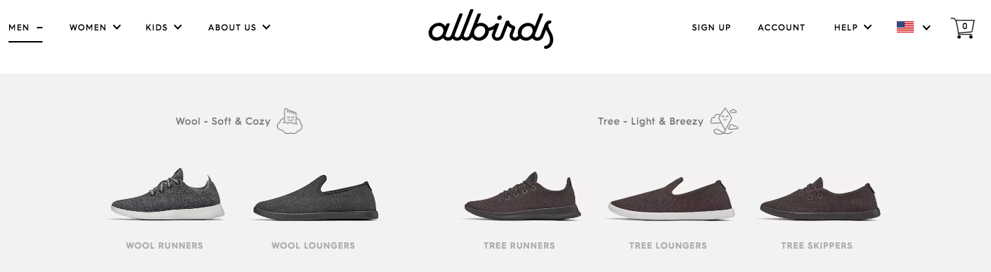
Using Allbirds as a guide, we’ll put you in charge of listing your Products. You’ve got this. You’ll also need to group these under Category headings that make sense to your customers.
When visiting Allbirds, you’ll notice that they first categorise by gender, and only after that can you filter by product type. Other stores with a wider range of products will more likely offer the ‘type of product’ choice first. You’ll have to do what suits your product range best.
Information Pages
So all that’s left to decide is the Information Pages. Keep in mind that you want to launch sooner, and you can always add more later. We’ve taken a look at Allbirds Information Pages, and come up with the following:
Enough to launch website:
- Help:
- Shipping
- Returns/ Exchanges
- Sizing/ Fit Guide
- FAQs
- About Us
- Contact Us
Optional Extras:
- Extra ‘About Us’ Stories
- Product Care Info
- Physical Stores List/ Map
- Gift Cards/ Vouchers
- Guarantee
- Partnerships
- Press
- Careers
There we go. Pick and choose your own Information Pages for launch, and start filling them with content!
Where do Landing Pages fit?
Organic search:
When users are searching for products, they’d rather see products than a word-heavy landing page. In e-commerce, category and product pages will often be used as ‘landing pages’.
So for product-specific searches, grab a Shopify plug-in to ensure you are doing SEO well on these pages. ‘On-page SEO’ is all about having the target keyword or phrase in all the right places in the code and content.
Your homepage can target 1-2 keywords, and for target keywords that are not specific products, you can also create extra information or blog pages.
Paid Acquisition (Ads) or Email Marketing Campaigns:
While you can direct Ad or Email click-throughs to your homepage or category/ product pages, you could also make specific pages for:
- Bundle deals – combining several items for a discounted ‘package price’
- Competitions – e.g. spin-to-win
- Targeting general style keywords – e.g. ‘comfy running shoes’
Tip: When marketing a specific product, link straight to that product. No need to add extra steps. For non-specific ad/ email campaigns, you can link straight to the homepage, but be sure to add a tracking code so you can measure the effectiveness of each campaign!
Landing Page URL:
While the Category and Product Pages will have a natural structure within Shopify or Squarespace, for other Landing Pages you just need URLs that contain keywords and have a structure that makes sense such as:
yourwebsite.com/spin-to-win
yourwebsite.com/runners/comfy-running-shoes
Enough reading, time to start doing!
Don’t get me wrong, creating content will still take time and effort (especially product images!), but you can quickly figure out your information architecture by looking at the examples of market leaders, like Allbirds.
Comments
Comments are disabled for this post